
1. Which artists were used as inspiration for this or was it just their technique? Why these artists?
Adam Hale and his surreal collages were in part inspiration for my collage because of the wacky combinations of magazine images he pairs together. Though I didn't directly follow in his minimalistic, strange combinations, I tried to create a piece with images that don't necessarily belong together as initially thought.
2. Describe the evolution of your piece. Decisions made. Compositional elements. Teach the group one new thing you did to make this piece.
This piece started out based on a Photoshop tutorial but drifted away as I couldn't find out how to make backgrounds fade into one another. So I kept the starry background and went from there, adding the planets and the geometric designs in a pleasing way.
3. How does this piece link in with your other pieces? What is the common thread?
The common thread between my pieces is an investigation into what our identity is and how it is constructed. This work is tied to this idea because it examines the role interpersonal relationships have on our identity. We are not solitary figures like the planets in the image, we are dependent on others to help establish ourselves.
(Geometric designs represent the connections and relationships with others that we depend on)
March 2017
Daughter of the Incas.
I found this image on Google with no more information about her identity than the fact that she is "The Daughter of the Incas", nothing more is known about this woman. Her identity is only that in her relations as a daughter. In this piece, I wanted to examine identity and how to construct some sort of personhood/culture quite literally around her.
Define which techniques you tried and mastered? Failed? One new thing you did to make this piece.
I was super pumped when Ms. O'Ryan showed me how to drag out sections of an image in Illustrator in order to create my own Incan design that would make her background. By dragging out bits and pieces of original Incan designs, I was able to create an entirely new design all my own that I feel parallels the hope of the project well. The design itself is a reconstruction of a design, a new interpretation; just as the Daughter's identity is recreated from an existing conception of her.
Describe the evolution of your piece. Decisions made. Compositional elements.
The first time I drew her I had a difficult time getting the side tilt of her head enough to be realistic. This first attempt taught me the importance that measuring the horizontal proportions are just as significant as the vertical proportions and relations of features to other features.
If you could consider doing something over, explain why you would do this?
Were I to do it again, I would be more patient and not slash out the eyes just because I was frustrated. However, after talking to my group, I think they are correct in thinking that slashing her eyes was meant to be because it relates to the deconstruction of identity.
How does this piece link in with your other pieces?
It is another examination of what gives identity, and how identity is deconstructed and reconstructed
February 2017
Collage Collaboration w/ Jordy
Define which techniques you tried and mastered? Failed?
The composition on the first two panels is pleasing, the third panel just needs more industrial pages/scraps to really have the feeling of almost claustrophobia from the number of distinctions that create more things. (I don't feel like collage can be mastered or failed, rather is better or less good compositions)
Describe the evolution of your piece. Decisions made. Compositional elements.
Jordy and I didn't really have a theme when we initially were cutting out images from magazines, but once we found the kick ass striped pages that would make the background of the piece, the theme evolved into an examination of borders and how we define things and by defining and creating borders we are essentially creating more things through distinctions. Following this idea, we made a sort of timeline of how as societies have formed there are more distinctions. The three pieces line up horizontally with increasing number of lines and decreasing line size.
The first panel shows a world with little distinctions; it is a monochromatic start of the universe. The second panel is based around the first man, the start of definitions, distinctions and borders. The last panel is closer to modern day where ways to define and separate groups and things are countless and almost overwhelming.
If you could consider doing something over, explain why you would do this?
More images in the last panel to truly give the feeling of endless things.
How does this piece link in with your other pieces?
Identity is defined by our own distinctions and concepts of what separates us
While I love charcoal, one of the difficulties with this piece was adjusting the value scale to take into account the brown of the paper. Suddenly the paper became part of the value scale, the happy medium between harsh white and intense black, a factor to be taken into account. Though I used white and black charcoal to do the highlights and lowlights respectively, I feel I could have done a better job using the in between values. Lighter white could have been better used to highlight contours in the cheeks and neck to create depth. However, I am proud of myself for being able to recognize where the darker and lighter parts of my face are with respect to my different facial features. But, my lips do need work because they are just values that are not the darkest part of the face, so it is hard to make the lips pop, with the 3-D dimensionality typical of lips.
This piece taught me the importance of angles in art. The angle at which a piece is viewed is not only important, but so is the angle at which an artist is creating a work of art. The view point of the artist is shown when looking at the work because the angle in which a piece is created determines the geometric proportions of the face. Therefore, when you look at my piece from straight on it does not necessarily look exactly like me simply because I was drawing it half sitting, half standing (depending on the day) and thus the dimensions may feel a little off. I decided to try and capture the different perspectives of my own face with pictures from various angles. *I finally understand why Ms. O'Ryan does much of her drawings standing up!* It definitely makes a difference, particularly because that is how the audience will likely view a piece when complete.
Overall, I made one of my biggest pieces ever, and am actually proud of it. I quite like the not completely blended face (I feel gesture and showing the strokes is part of my artistic identity), as well as the triangle cut outs that add to the composition of the whole piece. The triangles focus largely from the upper left corner and flow down to the bottom right, traveling across the page and my face, creating movement out of nothing, which has a funny sense of irony to it.
January 9th-27th 2017

Final Project "Not Resolved"
My fingerprint print ;P is an investigation of identity in the digital age. A fingerprint, feels like small and insignificant part of our body mainly because in order to understand its complexity we have to examine it deeply. Yet the issue in the digital age is that we have started to look less and less deeply into the world around us, we want everything in small, seven second blips that we can watch and forget about, what has happened to us? Our identity has turned into how quickly can I absorb information that is presented to me without recognizing these complexities that are naturally around us. My piece examines this dilemma using a fingerprint because it is this link between identity and digital media. My own iPhone opens up to my fingerprint, and that print alone, it connects me to the digital world, and yet it is this contradiction where this complex part of me is unlocking superficial information derived from social media and the internet, which gives the illusion that these websites and my presence on them are the source of my identity. However, in reality my actual identity is more complex much like a fingerprint. Ultimately, the print is printed on a mirror, a symbol for this superficial identity drawn from online presence that requires deeper introspection and investigation just like an individual’s fingerprint
December 2016

Project No. 3
I've been feeling really blocked creatively, a mind constantly going through mental checklists of everything I have to get done. Stress hasn't helped either... Ultimately this is what I have come up with: a reinterpretation of the Birth of Venus depicting a faceless woman painted onto the surface of a shell. Looking back and sharing this piece makes me feel really small and the piece insignificant purely because of its size that, to me, seems to scream insecurity. But, in writing this reflection I realize I need to acknowledge that the process of painting this was freeing, for the first time in weeks. It's small size forced me to look at the what gives definition in the body so that to final product actually resembled a person rather than an ambiguous blob.
Overall, I am proud about the texture and value I was able to get in such a small space. Getting this texture and value involved copious amounts of acrylic paint and small stokes with a toothpick...I would like to do a bigger piece with this same woman, though I do like the concept of the seashell, so doing a bigger piece is limited to the seashell size.
In my investigation of identity I returned to the Renaissance. Art of the Renaissance was groundbreaking in that it moved away from the Catholic church - the original identity giver. The church was the basis for the ethical code for that time so if an action was seen as wrong in the eyes of the pope or cardinals, you were nothing, you were heretic. But as groups of artists looked to antiquity, drawing inspiration from ancient Greece and Rome in order to return to their former glory. Now what made Botticelli's The Birth of Venus so revolutionary was that it was one of the first pieces of the time that did not depict the Virgin Mary. Rather by painting a pagan goddess, AND in the nude, Botticelli was radically changing the the identity of artists at this time. No longer did art have to revolve around the subject of the church and traditional depictions. Rree from these restraints, countless new ideas were thought up causing the rebirth of an entire culture.
November 17th, 2016
Project No. 2
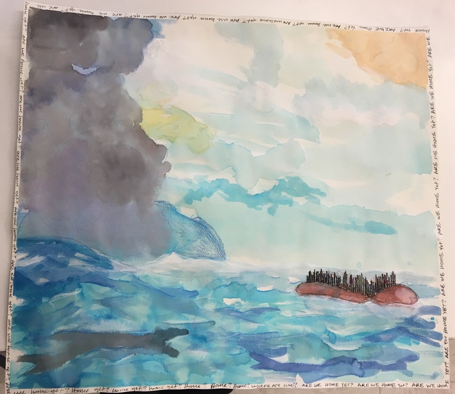
Define which techniques you tried and mastered? Failed?
In this piece I tried to use watercolor to create choppy waves based on the kitchy oil paintings of boats old people have. However, the issue with watercolor is that its a very mild and subtle medium which doesn't exactly pair with dangerous waves. I am proud though of my billowing clouds, though it doesn't really show up in the image, I went over some of my watercolor lines with colored pencil. The effect is intense puffy dark clouds.
Which artists were used as inspiration for this or was it just their technique? Why these artists?
With my first attempt, I tried referencing an oil painting, and as shocking as it may sound, oil and water are NOT the same. So in this piece I looked at a proper watercolor painting of a boat, but in place of the boat is a refugee inflatable.
Describe the evolution of your piece. Decisions made. Compositional elements.
Initially, the Syrians on the boat were going to be done in watercolor as well, but I couldn't get distinct, non-fuzzy figures, so I decided to reduce them to just lines, just as we do. America has started thinking of refugees as numbers on a bar graph versus individuals that genuinely need our help. As these "statistics" drift away, the word around the edge stick out even more as it evolves from "ARE WE THERE YET?" in all caps to "Are we there yet?" to "arewethereyet" to "Home yet?" to "Home?" to "Where are we?", this composition follows any kid in the back seat, a universal of any kid no matter where they are from.
If you could consider doing something over, explain why you would do this? What evidence do you have to explain this?
If I were to do something over I would likely make the sky more intense and dark to further convey my overall mood, the refugee journey is far from leisurely and calm. I also think in doing so, the ocean and the sky would be more distinct from one another, a change I'm not sure I would entirely approve of because I do like the running together of the two, it helps make the overall scene even more ambiguous.
October 17th-21st, 2016


Self Portrait: "And Land"
Right now there are just endless things I am supposed to be doing because they will be beneficial in my future, they will give me the future that I'm supposed to have. I'm just checking stuff off because I am forced to because it is the path society wants me to take-- it keeps me from becoming the characters on the game board. In this way I literally took a board game that has a path identifiable with everyone, connotative of childhood, and altered it with sharpie and collage to reflect the constant checking of the boxes that is my life right now.
The two children at the start of the game have their eyes covered like a censor bar, highlighting the innocence and lack of knowledge of what lays on the path ahead. Along with crossing out eyes, I censored the mouth of Queen Frostine who also has colored pencil bruises. These characters are all fairly dark because of how society seems to think the purpose of this distinct path is to avoid turning out like the characters on the edges of the board, beaten, addicted, imprisoned. Characters of Candy Land are altered under my sharpie, Princess Lolly becomes Pricess Folly, staring out with red eyes where the white is supposed to be. Also, rather than have lose a turn, it is simplified to lose due to the unpredictable nature of life that doesn't necessarily dictate a why.
What techniques did you try and master? Fail?
I don't know if I tried a new technique to be honest, though I did so assemblage and tried painting with sand/gravel (P.S.A. IT IS HARSH ON BRUSHES!!). I also used a pre-existing object, altering it to my own desires and taking this symbol of childhood and uncovering the reality by covering over it- an interesting contradiction. I used text in the piece in a snarky, pessimistic way to parallel where I am at.
How did you create dimension in the piece?
I created dimension by ripping up the actual board, assemblage as well as general collage. Perhaps I will try to cut the road out and mount it above the rest of the board... we'll see :)
Who or what inspired this piece? How?
I was largely inspired by fluxus artists who had no rules except to blur the line between artist and viewer. Inspired by these revolutionary artists before me, I ultimately intend the game to be played, and it is in the viewer playing the game that they conform to exactly what society expects me to do.
October 1st, 2016
|

Part of the Whole
|
Collage
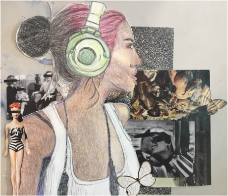
What techniques did you try and master? Fail?
The majority of this piece uses colored pencils not only to add color, but to build value. Despite having used colored pencils in a prior piece, creating value in this case was totally different largely because I decided I wanted to change the skin tone of the woman. Rather than duplicate the image the headphone woman was based on, I replicated her with darker skin-a new challenge for me. We get so used to relying on an image that will support us, that we can point to if we fail ("This is what I meant") Then when you stray from the path, you are in uncharted territory; using another image for reference, I got her skin color on paper. I am proud of my experimentation and the highlights that I was able to bring out, though I do feel like I could have gone darker since the only thing holding be back was not being able to maintain highlights and lowlights.
How and why did you build the collage in the portrait piece? What did you consider while combining your piece with others in the collage display?
For this piece, I really wanted the focus to be on the headphone clad woman as though she is "blocking out the haters". My composition revolved around this focus by keeping the colors mainly muted, allowing the woman to be drawn to the eye. I also decided to cover up any eyes with a stark, black line emphasizing her own attempts to drown out the world around her.
When combining my piece with others, I first wanted my frame to complement the composition and color of the piece, as well as interacting with the surrounding pieces. The drowning out theme was increased by the surrounding pieces, where all have the same woman focused on what is ahead, on what we don't know...The frames were a nice way to both break out of the existing rectangular frame, while also being a unifying element to our unique artworks. And the string literally tied it all together.
September 1-15, 2016
